
When it comes to decorating your home, each family member may have a different taste. In fact, it has been common for years for each room to be painted a different color (initially with the ceiling included, then leaving it white). But, do you know how to balance colors?
Colors not only affect the appearance of a room, they also influence the mood and how you feel within that space. Therefore, knowing how to balance colors is essential to achieve a harmonious environment. But how do you achieve that? Pay attention and you will see.
Understand color theory

As you know, or if not, we will tell you, there is a color theory. Based on this, colors can be divided into three main groups:
- Primary colors: Red, blue, and yellow.
- Secondary colors: Orange, green, and purple, obtained by mixing two of the three primary colors.
- Tertiary colors: These are obtained by mixing a primary color and an adjacent secondary color.
Based on this theory, you can find examples of colors that can be balanced appropriately or cannot be mixed.
Choose a primary color palette
Another important point in balancing colors is establishing the primary color palette. When decorating, it is advisable to select one or two dominant colors.
What does that mean?
It means that these colors will be present in all rooms of the house. For example:
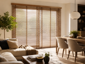
- Warm neutrals: Shades of beige, brown, cream, and warm gray.
- Cool and relaxing colors: Soft blues, pale greens, and cool grays.
- Bold and vibrant colors: Intense reds, bright yellows, or striking greens.
You should choose these colors so that the entire house has a presence of them, regardless of whether you can use other colors later. In fact, that is what we are going to talk to you about next.
Add accent colors
Once you have the primary color palette, you need to think about accent colors, those that complement and are used in smaller details such as figures, curtains, pillows, blankets, and more.
These always offer a contrast.
To make it easier for you to understand, imagine that you have a room with warm neutral tones. And you place a couple of pillows in intense red. When a person enters that room, they will see that everything is balanced, but those pillows will stand out and, far from seeming out of place, will draw attention to that area.
Understand color psychology
Earlier, we mentioned the importance of colors in our mood and how we can feel in the rooms. This is related to color psychology.
Each color has a meaning or is associated with a mood. For example, blue is often associated with calm and serenity, while red can evoke energy and passion.
Therefore, before choosing colors, it would be advisable to know what you want to feel in each room.
Play with color proportion
Did you know that balancing colors does not mean they have to be “equal”? Sometimes you can change the proportion of colors and achieve visual effects with that.
To make it easier for you to understand, imagine that you paint a room and one of the walls with an accent color. The rest are a different shade. The proportion, as you can see, is not equal, but the visual result will attract attention.
Use color samples
Or rather, if you are not sure what color to use, try painting small areas on the walls to see it from a different perspective. In fact, looking at how the color looks at different times of the day can help you balance the colors without surprises later on.
Maintain cohesion throughout the house

One of the problems when painting rooms with different colors is that the color palette may not flow from one room to another.
We don’t mean that all rooms should be identical, but if you want the decoration to look good, you have to visually connect them. And this can be achieved with common design elements or colors.
Do not be afraid of dark colors
Often, dark colors are thought to make the space look smaller or darken the rooms too much. In reality, they can be a perfect color for accent walls or to highlight parts of a house.
In addition, they add a touch of warmth and sophistication. You should not overuse them, but you should not avoid using them either.
Don’t forget about coherence
Finally, a key point in balancing colors is to maintain coherence in the decoration. And how do you achieve that? Well, as we told you before, by making the colors relate to each other in all the rooms.
With all these tips, you are sure to be able to balance the colors properly and achieve perfect decoration.
via: MiMub in Spanish