The blending of beautiful colors in interior design is a very attractive and interesting task. The color holds vital importance in interior design because we all know that each color has effects on our mood. They can, by themselves, push us to feel emotions like happiness, energy, and romance. Note some details to achieve combinations that make your decoration shine even more.
Color Combinations for Home Decorating
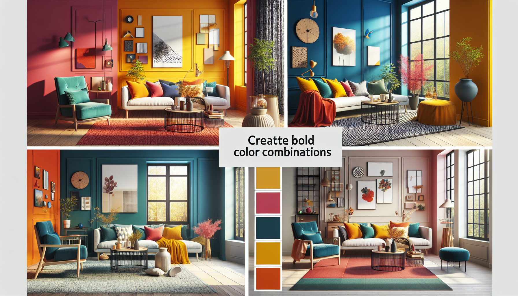
If a color improves our mood, why not take advantage of one or more? These are suggestions for the boldest, who are not afraid of maximum colorfulness and excessive use of color!
You don’t need to be a scientist to pick and apply color in a room. Whether through wall paint, the color of textiles, or furniture, it’s all about your particular taste for certain colors because your decoration should be tailored to you. What you really like! This way, you enjoy your spaces at all times.
Stick to the basic rule of color, as classic decoration guides us to perfection to have the right amount of color. That looks good, and this is 60% of the room should be a dominant color. 30% should be the secondary color or texture, and the remaining 10% should be a color accent. Colors combine or contrast as you wish.
Contrasts, Combinations, and the Color Wheel
The color wheel is an effective means for contrasting colors. Contrasting colors are those opposite each other on the color wheel, such as red and green, orange and blue, yellow and purple. A glance reveals that from there, it’s easy to find those that contrast. And the result is fabulous because, by their own individual qualities, together they have greater brightness and intensity.
Mixing contrasting colors makes one stand out against the other, in a way that is visually attractive. To achieve elegant, modern, cheerful mixes, it’s always good to choose a dark part of the color wheel, that is, reddish, bluish, or purplish colors.
Combining Colors in Decoration
The starting point in choosing colors will be what you want the space where you apply it to project. If you want a vibrant, cheerful, carefree space, go for shades of reds and yellows. As you can see in the images, beautiful shades of red with blue work as well. For those who want a relaxed and elegant environment, but very coquettish, shades of greens and blues. Cheerful spaces filled with energy use shades of greens and yellows.
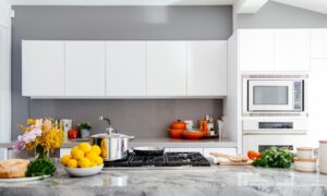
When choosing colors, there’s plenty to consider, and well-placed in quantity, we will have magnificent combinations. As also seen in the cover image of this note, choose as many colors as you like. It works well if you choose shades that look good. Especially those that are of soft intensity and create elegant, modern, calm, and comfortable environments.
Plenty of color for successful combinations
There are enough colors for all tastes. It’s important to remember that complementary colors are chosen according to the principle of color combination. Once you have chosen the basic or main color, it’s easy because you can opt for these color schemes. Perfect to achieve ideal combinations like these.
Complementary involves the use of two opposite colors and some of the relevant shades, focusing on color contrast. Complementary is the use of a dominant color and two colors that are next to it on the color wheel, for a very attractive result with hints of visual joy. Triadic to obtain very contrasting colors, is achieved by choosing the colors in a triangular manner around the color wheel. A bold decoration where highly contrasting colors prevail. But with the detail of staying in the same hue. The square combination uses four equidistant colors, and the result is completely contrasting. The result is ultra-modern, striking, and energetic.
If you like colors and want an elegant environment where color is the protagonist of the decoration, take inspiration from these images and decorate, long live color!
Images: Unsplash