Metallic colors were one of the most important characteristics in the world of interior decoration in the 1960s. Paco Rabanne was one of the first to embrace this type of shades, influenced by the greatest event of the century: the moon landing. Almost six decades later, this trend has reemerged with strength.
But these colors are not limited to the runways this year. In the field of interior design, the trend towards metallic tones in decorative elements and wall coverings has flourished, infusing a blend of sophistication and modernity into spaces by reflecting the fusion of nature and technology, creating dynamic and immersive environments.
The new Metal x Patina collection from Arte reflects timeless luxury with a touch of rebellion. Each design is printed on authentic metal sheets, creating a worn plaster effect with an artistic touch on the wall. Each motif evokes a specific painting technique or craftsmanship. Are you bold enough to try it?
Silver

The silver hue can be seen as a metal with a cool and refreshing quality that provides abundant luminosity. Recognized as the ultimate metallic tone, the color silver is present in elements such as aluminum, steel, and pewter. It can manifest in bright tones, such as chrome steel, or in more opaque finishes, but in all its variants, it harmonizes perfectly with any environment. This is because its tone is close to gray, which is considered an essential neutral color, along with white and black.
Platinium, from Arte, is a block pattern that reflects a timeless luxury with a rebellious touch. Each design is printed on authentic metal sheets, creating a worn plaster effect with an artistic touch on the wall. Each motif evokes a specific painting technique or craftsmanship. Are you bold enough to try it?
Copper

The copper hue, on trend within the metallic spectrum, emerges as a metal that requires greater skill to achieve harmony compared to its previous counterpart. This is due to its intense orange hue, which leads it to combine particularly well with whites and blacks, in conjunction with light wood tones. It is also compatible with harmonious ranges of yellows, oranges, and ochres, and it does not clash when accompanied by greens and turquoises as complementary colors.
The Impasto model takes its name from the ancient painting technique “impasto,” which involves the application of thick paint with thick brushstrokes. This enhances the texture of the wall covering, achieving highly realistic results. This pattern, printed on a metal sheet, combines the best of two worlds: craftsmanship in harmony with the industrial.
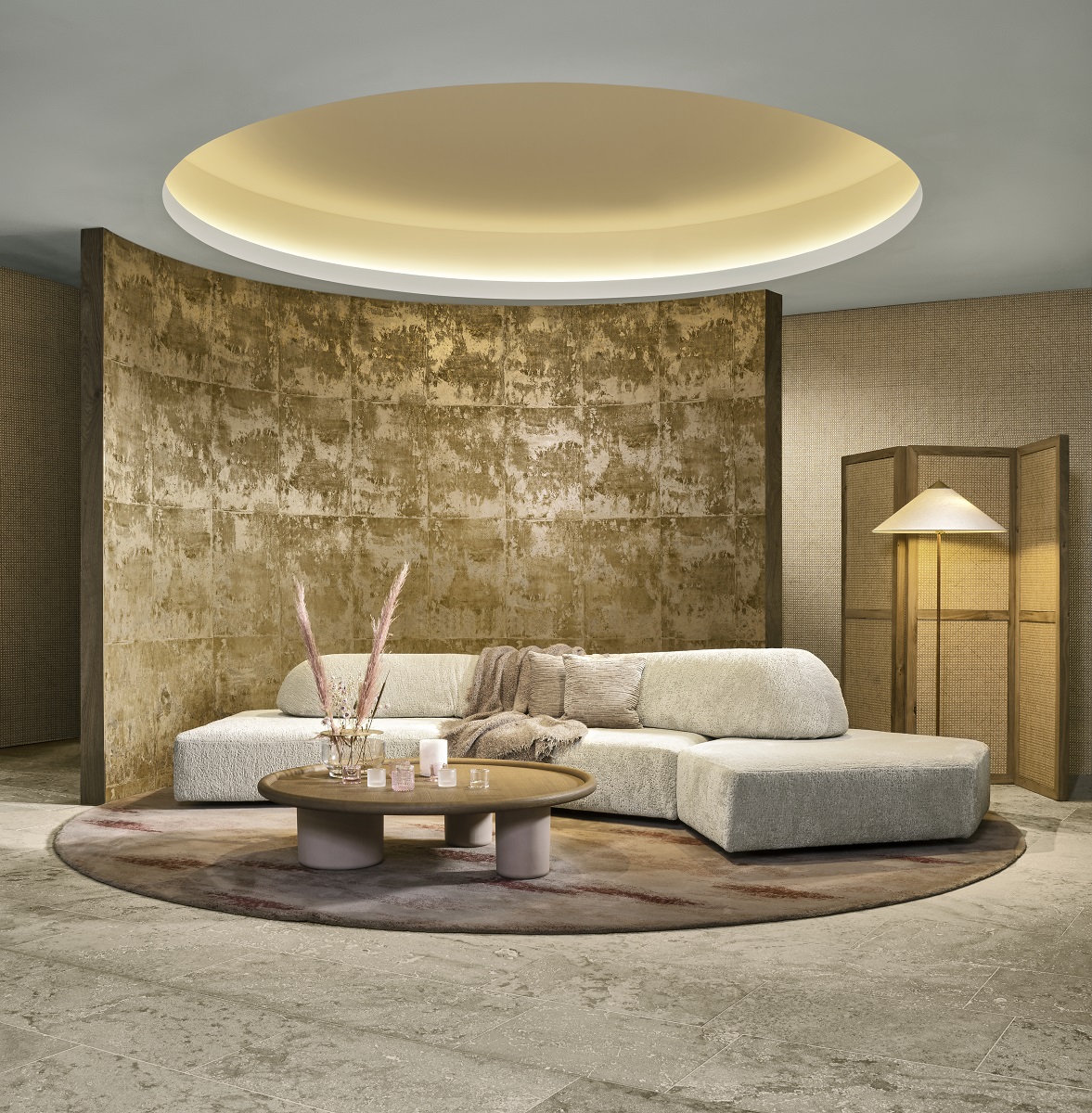
Gold
 Source: MiMub in Spanish